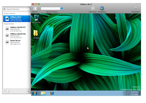
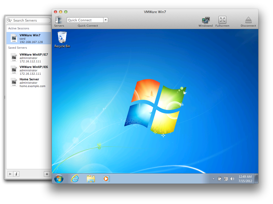
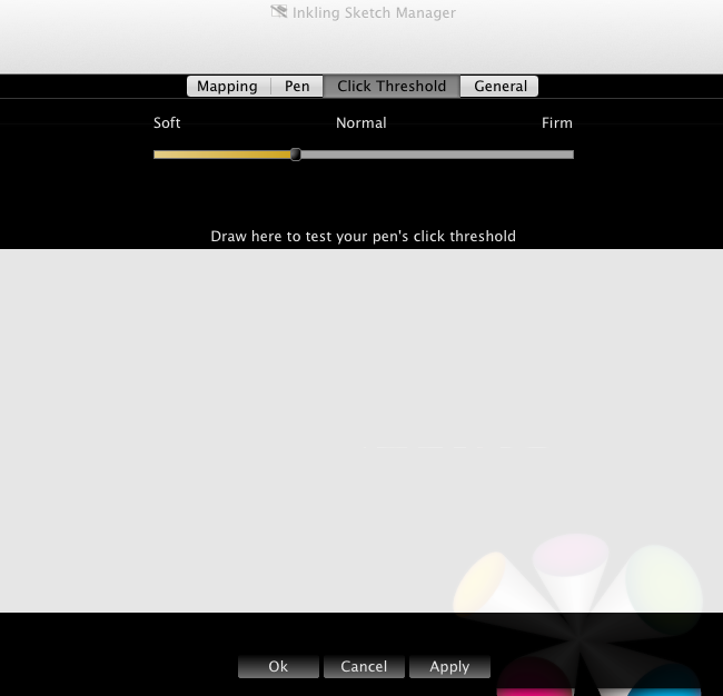
A little over a month ago I had quite a lot of time to myself so I decided to update the graphics of an open source application to be compatible with retina Mac screens1. I choose an application which I frequently use and which would otherwise probably not have been updated, namely CoRD (the screenshot on their site is not up to date). My intention was to get this post up sooner but due to some issues with getting Octopress, ruby and the ruby gems to work it has been delayed by a few weeks2…
CoRD is a native remote desktop client for Mac OS X and allows you the user to connect to Windows machines over the Remote Desktop Protocol (RDP). There is also the official client by Microsoft but it keeps crashing for me, especially when quitting it, and it does not have a built-in server list. Two things which CoRD provides.
Sadly CoRD has received less updates as time has passed by. A transition to FreeRDP, which is mostly required, has been planned for quite a few years now. As such I felt that the only way for me to not have to suffer while looking at the user interface graphics as well as the application icon was to fix them myself. Initially I planned to just update the existing original graphics files for retina and then re-export them as an additional @2x file. This did not happen.
As I initially could not find the original graphics files I set out to re-create them instead, from the ground up. When at the last icon, I was unable to find a way to make the application show it in use so I looked around on the website for a screenshot of it and stumbled upon a ZIP file with the originals. Thus that last, clock, icon was more or less the original scaled to @2x. More on the user interface graphics later, now on to the application icon.
Application Icon
The original application icon file did obviously not contain any retina assets since the icon was created long before Apple settled down and decided to go the iOS way with @2x. If you are view this page on a retina screen you should be able to recognise the blurryness of the original application icon shown below.
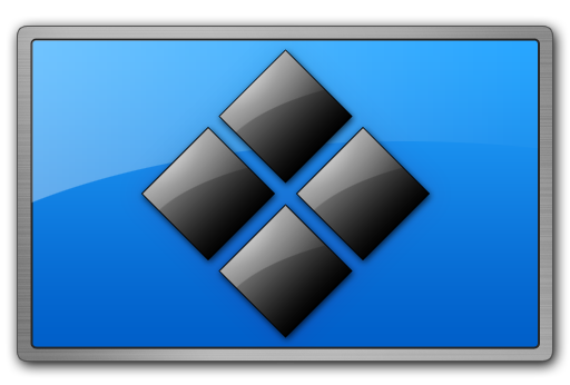
The intention with the new application icon was to capture the look and feel of the old icon – to make users used to the old versions feel at home – while still making it feel new and shiny. Furthermore the goal was to make the icon show how CoRD bridges OS X and Windows and it being a utility application.
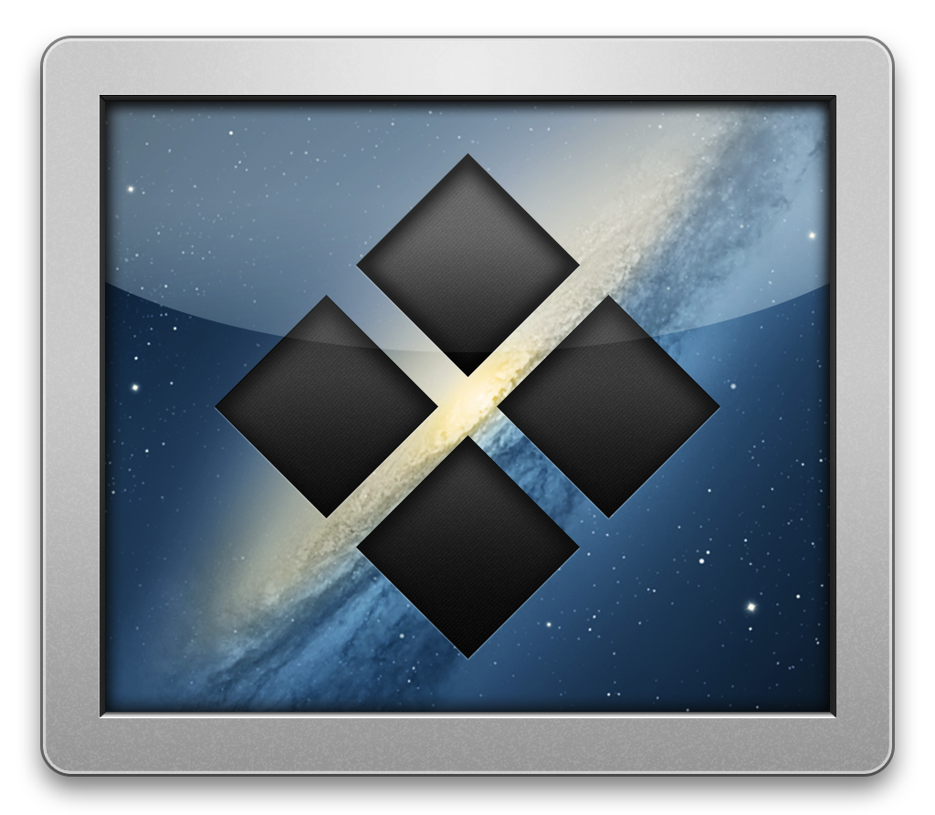
The icon tries to convey that it bridges the gap between OS X and Windows by utilising the starry, galaxy styled photos Apple use as desktop backgrounds by default in OS X. In turn the black cubes both reflect the connection to the Windows flags as well as the old application icon. Lastly the type of frame matches the utility application icon frame used in OS X. The frame matches that of the System Preferences icon quite closely. The new icon also fits a lot better in the dock, taking up the same amount of vertical space as Apple’s icons.
Even though the icon is almost completely made using vector shapes and layer effects in Photoshop, exporting it to 10 different sizes was a real chore… Well OK, the 16-by-16 pixel @1x icon was created separately. See it below, preferably on a @1x screen as it will look blurry on a @2x screen due to scaling.

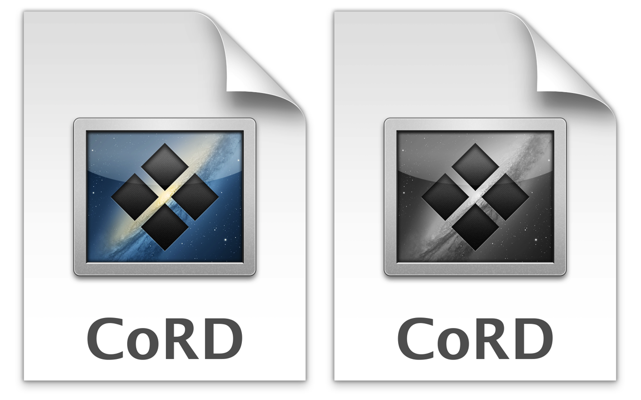
The application icon was also used a the basis for the new document icons. They are very much standard (compliant) white sheets of paper with a curled corner with the application icon in the middle. Another 10 exports in color and 10 in grayscale.
User Interface Graphics
While updating the user interface graphics I tried to keep them somewhat similar to how the looked previously. Although some things were revamped, such as the next and previous session buttons which now use standard controls instead of being round custom butcons.

The new icons are, like with the application icon, intended to look quite similar to previous ones but with a more updated look. Not a lot to say about them besides that the @2x versions look better than the @1x.

You can check them all out by visiting CoRD’s GitHub project page or by downloading CoRD and running it directly. The Photoshop files are located in the GraphicsOriginals directory in the root, except for the application icon where the .psd files are located in Resources/App Icon, while the exported .png images exist in the Resources directory.
All the icons and graphics are licensed under the Attribution-NonCommercial-ShareAlike 3.0 United States (CC BY-NC-SA 3.0) and the copyright belongs to Aron Cedercrantz.

